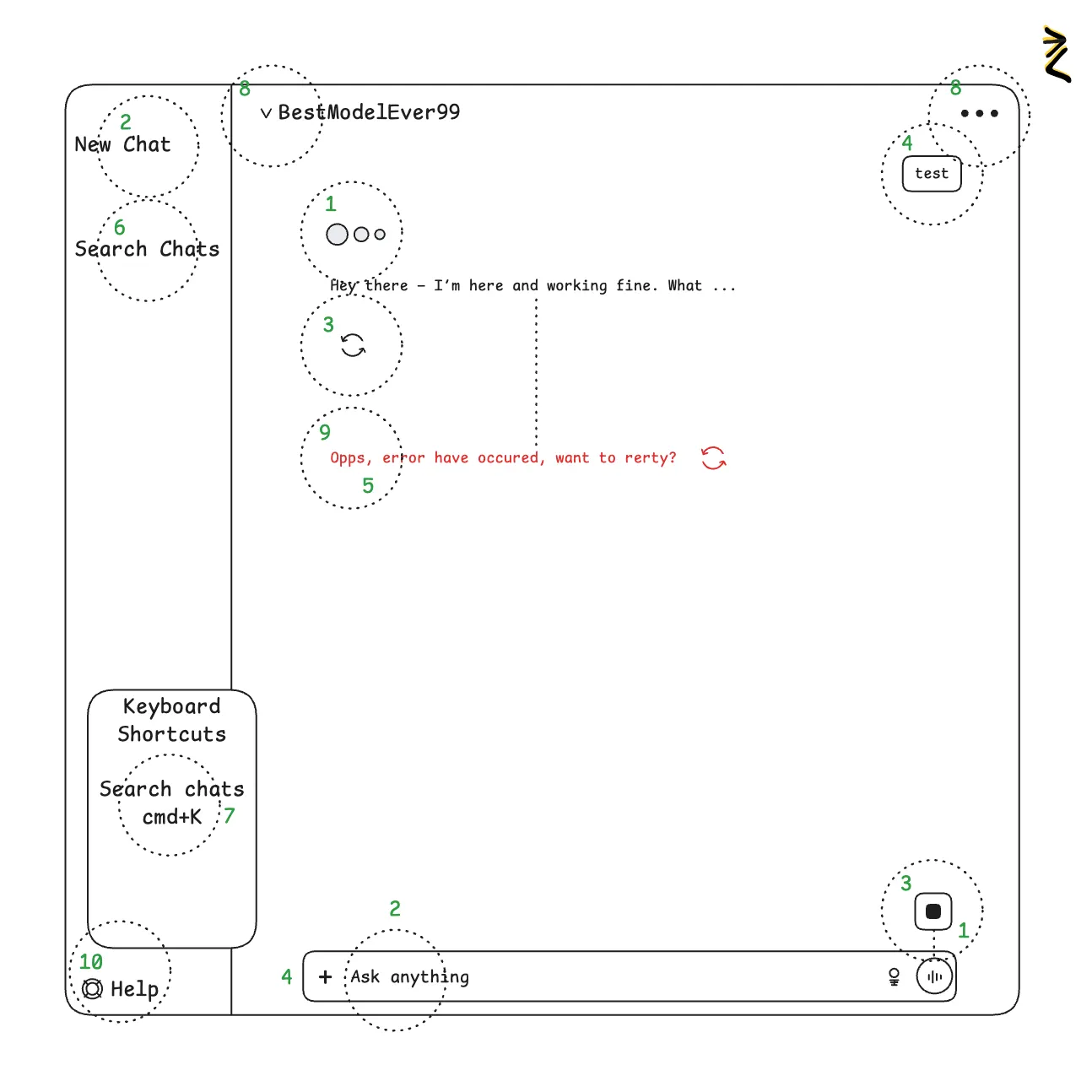
How Jakob's Ten Usability Heuristics applied in chatgpt.com
✅ During the response user may abort the response streaming with a “stop” button. If Answer is already in UI, user may reload or downvote the response.
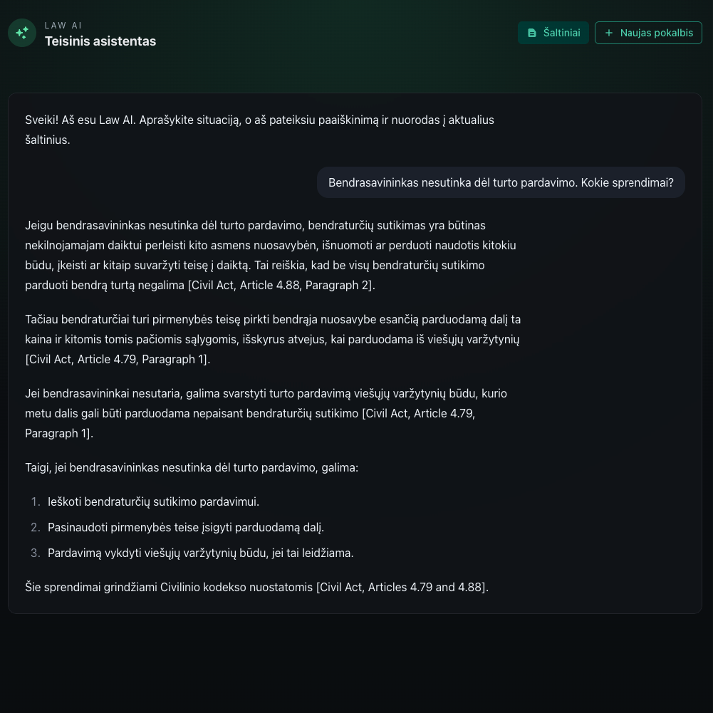
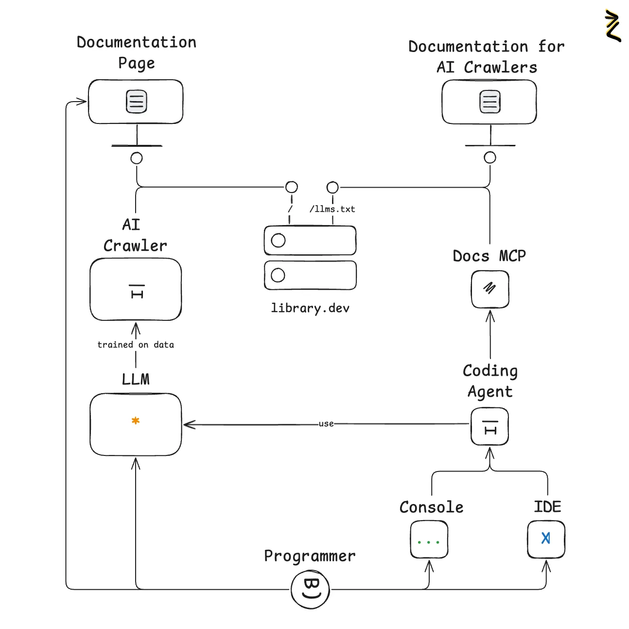
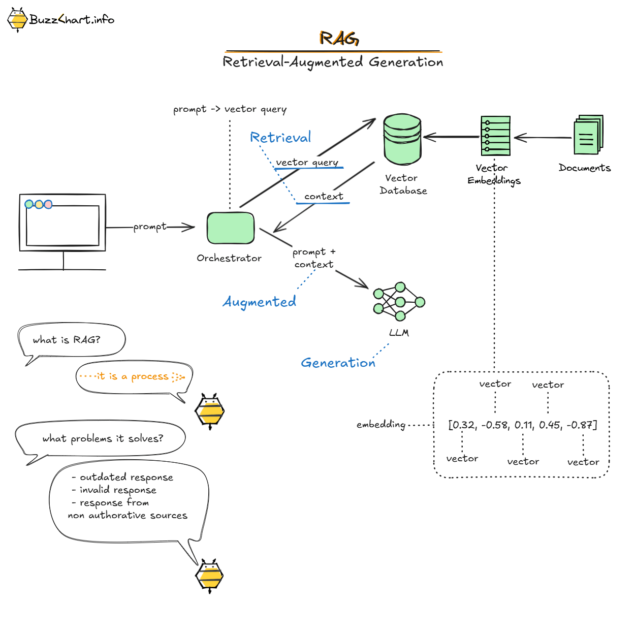
Related concepts: Building a Lithuanian Law Assistant with LLM and RAG (part 2) , Building a Lithuanian Law Assistant with LLM and RAG (part 1) , llm.txt — A Standard for AI Documentation Access , RAG .
1. Visibility of System Status
Designs should keep users informed about what is going on, through appropriate, timely feedback.
✅ App using loader indicator, response streaming and submit button is changed with “stop” button.
2. Match between System and the Real World
The design should speak the users' language. Use words, phrases, and concepts familiar to the user, rather than internal jargon.
✅ Text inputs has placeholder “Ask anything”, which is phrase tareted for chat user, opposed to “enter prompt”.
3. User Control and Freedom
Users often perform actions by mistake. They need a clearly marked "emergency exit" to leave the unwanted state.
✅ During the response user may abort the response streaming with a “stop” button. If Answer is already in UI, user may reload or downvote the response.
4. Consistency and Standards
Users should not have to wonder whether different words, situations, or actions mean the same thing. Follow platform conventions.
✅ Asking question pattern is similar to google with one input to start interaction with the app. Chat is created with user messages aligned right in separate section from the response from LLM, implementing visual chat representation pattern.
5. Error Prevention
Good error messages are important, but the best designs prevent problems from occurring in the first place.
🤷🏻 Probabalistic systems may produce errors, that are hard to expect or prevent. No data regarding the error prevention in chatgpt.
6. Recognition Rather Than Recall
Minimize the user's memory load by making elements, actions, and options visible. Avoid making users remember information.
✅ User should not remember how to access previous chat or where chat is. Previous chats are available in the side panel together with search.
7. Flexibility and Efficiency of Use
Shortcuts — hidden from novice users — may speed up the interaction for the expert user.
✅ App contains shortcuts for advanced users, which can be found in the help dialog or by clicking “command + /”
8. Aesthetic and Minimalist Design
Interfaces should not contain information which is irrelevant. Every extra unit of information in an interface competes with the relevant units of information.
✅ A lot of app configuration is hidden in the main view under the “…” icon at the top right. Model choise is implicitly predefined and you can expand available models with a separate dialog.
9. Recognize, Diagnose, and Recover from Errors
Error messages should be expressed in plain language (no error codes), precisely indicate the problem, and constructively suggest a solution.
✅ Human-readable error messages are used as response in case of error together with “reload” icon, allowing to recover from the error.
10. Help and Documentation
It's best if the design doesn't need any additional explanation. However, it may be necessary to provide documentation to help users understand how to complete their tasks.
✅ At the bottom there is a help button, opening help dialog with usr guide and shortcuts for power user.
Nielsen Norman Group