Radix UI: A Modern Headless Component Library (LLM-Research)
Radix UI is an open source headless UI component library for building design systems, websites, and web applications. Launched in late 2020 by the Modulz team, Radix UI provides a collection of unstyled primitives – common UI patterns like dialogs, menus, tabs, checkboxes,...
Related concepts: Why Radix UI Is So Popular? , Building a Lithuanian Law Assistant with LLM and RAG (part 1) , Do Not Use Mocks in Your Tests , Building a Lithuanian Law Assistant with LLM and RAG (part 2) .
Introduction
Radix UI is an open-source headless UI component library for building design systems, websites, and web applications. Launched in late 2020 by the Modulz team, Radix UI provides a collection of unstyled primitives – common UI patterns like dialogs, menus, tabs, checkboxes, tooltips, and more – implemented with accessibility best practices. Unlike traditional UI frameworks, Radix components come with no default styling, giving developers full control over the look and feel. This headless approach means Radix can be integrated with any styling solution (CSS, Tailwind, CSS-in-JS, etc.) to match your brand or design system. Radix UI is built for React (community ports exist for Vue and Svelte), and its components serve as low-level building blocks that developers can compose into higher-level UI elements. Over just a few years, Radix has quickly become popular for its flexibility, robust accessibility, and developer-friendly design.
Why Radix UI Is Popular and Widely Adopted
Radix UI has won broad adoption among front-end developers due to a combination of practical benefits and strong community backing. Many developers turn to Radix because it simplifies UI development and maintenance – providing pre-built behavior for common components so you don’t have to reinvent. Crucially, Radix components are fully accessible out of the box, with rigorous compliance to WAI-ARIA guidelines and extensive testing across browsers and assistive technologies. This addresses a major pain point: ensuring custom components meet accessibility standards.
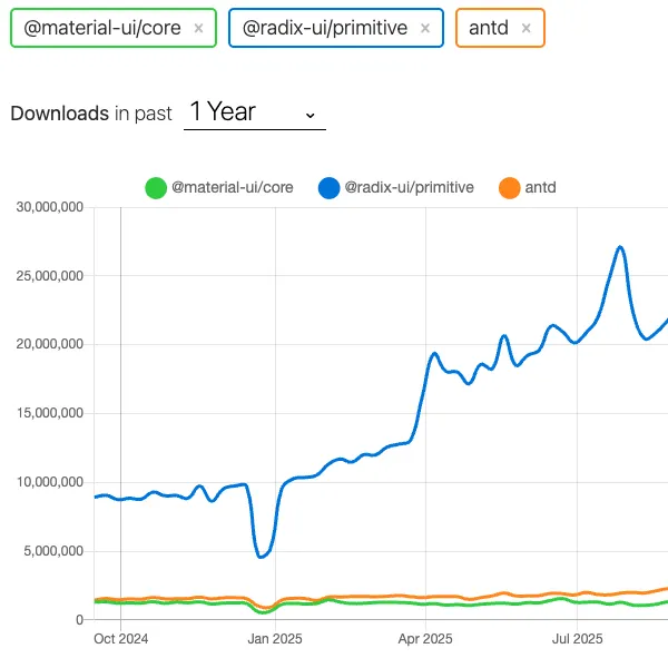
Radix’s reputation for quality and flexibility has led to its use in both personal projects and large-scale applications. It’s battle-tested by industry leaders: companies like Vercel, Supabase, Linear, and CodeSandbox use Radix primitives as the foundation of their design systems. The library has accumulated over 20,000 combined GitHub stars (across Radix repositories) by early 2024, reflecting its strong community support. Additionally, Radix’s success has spawned or influenced other tools – for example, the popular ShadCN/UI library (a set of pre-styled components) is built on Radix primitives, which further boosted Radix’s visibility in the React ecosystem.
Another reason for Radix’s popularity is its developer experience and documentation. Developers often praise Radix for an intuitive API and thorough documentation with plenty of examples. In comparisons with similar libraries (like Adobe’s React Aria), Radix is noted to have a “nicer API” and “nicer documentation”, making it easier to adopt. The combination of flexibility (no enforced styles), reliability (accessibility and testing), and community momentum (backing from real-world usage and open-source contributors) has made Radix UI a go-to solution for modern React projects.
Architectural Design Principles
Radix UI’s architecture is guided by a few key design principles that set it apart from typical UI kits:
Accessibility First: Every component adheres to WAI-ARIA design patterns and enforces correct semantics, focus management, and keyboard navigation by default. Accessibility isn’t an afterthought – it’s built into the core of each primitive so developers can build inclusive interfaces with less effort. For example, Radix handles ARIA attributes, focus trapping in modals, keyboard shortcuts for menus, and other tricky aspects automatically.
Unstyled & Headless: Radix components contain only the essential markup and logic needed for functionality – no preset CSS or visual styling is included. This “headless” approach means developers have a clean slate to apply their own styles or design system. The benefit is total design freedom and no need to override unwanted default styles (a common issue in themed UI libraries). The tradeoff is that using Radix effectively requires pairing it with a styling solution and doing custom CSS or theming (more on this in Tradeoffs below).
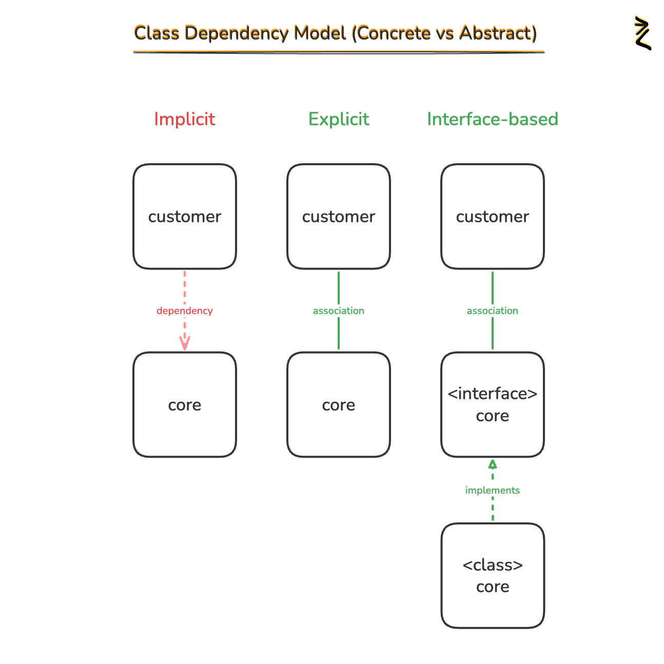
Composable, Open Component Architecture: Radix primitives are designed as compound components made of granular sub-parts (e.g. a Dialog consists of
<Dialog.Root>,<Dialog.Trigger>,<Dialog.Content>, etc.). This open architecture allows developers to use only the parts they need and compose functionality flexibly. Radix even provides anasChildprop on every component part, which lets you seamlessly integrate Radix behaviors into your own custom components or different HTML elements (radix-ui.com). For example, you could wrap a Radix Tooltip around your existing button component by usingasChildso that the tooltip’s trigger logic is applied to your button without altering its styling or structure. This design principle of composition and openness means Radix can serve as the “plumbing” of UI components while you bring your own markup or higher-level abstractions.Uncontrolled by Default: Many Radix components are uncontrolled (internally managed state) by default, with the option to use controlled mode if needed. This means the components manage their open/closed state or value internally so you can get up and running quickly without wiring up a lot of state management. You can still control them via props when you need to integrate with external state. This design choice simplifies usage for common cases while not limiting more complex scenarios.
Consistency and Developer Experience: Radix is built with TypeScript and offers a fully typed API, ensuring strong compile-time guarantees and IntelliSense support. All components share a consistent API design and naming, making the library predictable to work with. The team explicitly prioritizes dev experience – for instance, the API surface is kept as uniform as possible across components, and utilities like the
asChildprop provide escape hatches for unusual needs. The documentation further enhances DX by providing ready-to-use code snippets and examples for multiple styling approaches (vanilla CSS, Tailwind, CSS-in-JS) for each component. This helps developers quickly understand how to implement and style a primitive in whatever tech stack they prefer. Overall, Radix’s architecture emphasizes clarity, modularity, and empowerement of the developer.Incremental Adoption: Unlike monolithic UI frameworks, Radix allows granular installation of components. You can install the entire
radix-uipackage and tree-shake what you use, or individually import just the needed @radix-ui/react-* packages. This means you can introduce Radix one component at a time into an existing codebase, or avoid adding unnecessary bundle size. The incremental adoption principle reflects Radix’s flexibility – it doesn’t force a heavy dependency; you only bring in what you need. This design is especially useful in large apps or gradual migrations.Framework Compatibility (SSR): Radix primitives are designed to work in modern React frameworks and support server-side rendering. SSR support means Radix components can render on the server without issues, which is important for Next.js, Remix, Astro, and other SSR/hybrid frameworks. (One implementation detail: for React versions below 18, Radix uses hydration to generate unique IDs for certain components on the client.) In practice, teams have successfully used Radix with Next.js and other SSR setups, aligning with the library’s goal of being production-ready for any app architecture.
In summary, Radix UI’s construction is guided by separation of concerns (logic vs style), accessibility, and composition. It serves as a reliable foundation of UI behavior, letting developers focus on styling and integrating these parts into their own design system.
Defining Characteristics of Radix UI
Building on those principles, Radix UI has a number of defining characteristics that distinguish it from other UI libraries:
Headless Primitives: Radix offers “primitives” rather than fully styled widgets. Each primitive provides the necessary structure and behavior for a common UI pattern, but no default theme. This makes Radix extremely versatile – developers use it as the base layer to craft custom-styled components. For example, Radix provides a Select component logic (with keyboard navigation, ARIA roles, list virtualization, etc.) but you are free to style that dropdown to look however you want. This is ideal for design systems that require a unique look or must adhere to strict brand guidelines, as Radix will not impose any visual style.
Strong Accessibility Guarantees: One of Radix’s hallmark features is that all components are accessible by design. They follow official patterns (e.g., WAI-ARIA Authoring Practices) and handle tricky accessibility tasks internally. This includes proper ARIA attributes, labeling, focus trapping, keyboard controls, and ensuring components work for screen readers and assistive tech. For developers, this means you can trust Radix components to meet WCAG and ARIA standards out-of-the-box. This defining trait addresses the common failure of many custom-built components which often overlook accessibility. Radix essentially bakes in accessibility so you don’t “sweat the small stuff” with low-level ARIA details.
Granular Component Composition: Radix primitives are broken into subcomponents (often exported as an object of React components). This compound component pattern means you assemble a component by using its parts in JSX. For instance, to make a modal you use
<Dialog.Root>(overall container and state),<Dialog.Trigger>(the button that opens it),<Dialog.Content>(the modal content container),<Dialog.Close>(a close button), etc. This granular approach is a defining characteristic because it gives developers fine-grained control. You can choose to omit certain sub-parts or wrap them to extend functionality. Radix’s internal state management and context ensure these parts work together seamlessly (e.g., opening the Dialog.Root via the Trigger, or closing when Close is clicked). This is a contrast to monolithic components that handle everything internally; Radix’s style encourages clear separation of each interactive part.asChildand Customization: The presence of theasChildprop on Radix components is a unique characteristic that underscores Radix’s focus on flexible composition. By settingasChild, you can render a Radix component as a different underlying element or even your own component, without losing the built-in behavior. This allows for powerful use cases like combining multiple Radix behaviors on one element, or integrating Radix logic into fully custom markup. It effectively makes Radix a “behavior layer” that you can attach to any element. This level of flexibility is a defining feature not commonly found in all UI libraries.Radix Ecosystem (Colors, Icons, Themes): Radix UI isn’t just React primitives; it also provides complementary resources:
Fully Typed and Modern React: Radix is written in modern React with hooks and context under the hood, and distributed as typed ES modules. This means it fits naturally in React 16.8+ apps. The API is entirely TypeScript, providing auto-complete and type safety which is a big plus for developer productivity. Radix also stays up-to-date with React best practices (for example, compatibility with React 18 and concurrent features, proper use of React context to avoid prop drilling, etc.). In essence, it feels “built for React” in a modern way, which is a key characteristic for those who want to leverage the latest React features without worrying about library compatibility.
In combination, these characteristics make Radix UI a highly flexible, accessible, and developer-centric UI library. It’s essentially a toolbox of robust UI behaviors that you can assemble and style however you need, rather than a pre-themed component kit.
Tradeoffs and Limitations of Radix UI
While Radix UI offers many advantages, its design choices do come with certain tradeoffs and limitations. It’s important to understand these when deciding if Radix fits your project:
No Ready-Made Aesthetics: The headless nature is both a strength and a weakness. Because Radix provides no default styles, developers must invest time in styling every component to match their UI. This can slow down initial development if you’re looking for plug-and-play visuals. Teams with tight deadlines or limited design resources might find Radix a burden since you effectively start from scratch on the styling front. In contrast, a library like MUI or Chakra UI gives you pre-styled components that look good out-of-the-box. This tradeoff means Radix is best if you want that control over styles; but if you just need a quick consistent UI without custom design, Radix might feel like extra work.
Increased Implementation Effort: Using Radix can introduce a bit more complexity in markup structure and styling. Because you compose components from primitives, the code can be more verbose (multiple subcomponents for one UI element) compared to using a single premade component. Additionally, ensuring all those pieces are styled correctly and cohesively requires solid CSS knowledge. For developers who are not as comfortable with CSS or design, a headless library like Radix can have a steeper learning curve than a styled component library that encapsulates the design. As one analysis noted, the lack of built-in styles means “that’s extra work for us since we have to define styles for the components we need”, which may not be ideal depending on your team’s strengths and priorities.
Limited Component Spectrum (as of 2024): Radix UI is relatively young and focuses on fundamental UI patterns. It offers fewer total components than some older, full-featured UI libraries. For example, as of early 2024 Radix had around 28 components, whereas libraries like Material-UI had ~50 and Ant Design ~66. Most of Radix’s components cover common needs (menus, modals, forms, etc.), but you might find certain higher-level components missing. For instance, Radix lacked a built-in “combobox/autocomplete” or advanced datagrid for a long time (though it has primitives like Select). If your project needs a very specific widget that Radix doesn’t provide, you would have to build it yourself or pull in another library. (However, Radix is continuously growing, and its modular nature means you could mix Radix with other headless components if needed.)
Design Consistency and Theming is Your Responsibility: With great power comes responsibility – since Radix doesn’t enforce a design system, it’s up to you to ensure consistency in how you style each component. If not carefully managed, there’s a risk of inconsistent look and feel across your app because Radix won’t provide that for you. In contrast, something like Ant Design comes with a cohesive theme out of the box. Radix requires a theming strategy (whether it’s a custom CSS framework, Tailwind config, or using Radix Colors/Theme, etc.) to unify the UI. This is a tradeoff where Radix gives freedom at the expense of potentially more upfront design work.
Small Quirks: There are a few minor limitations or opinionated decisions in Radix that users should note. For example, the Radix Icons package fixes all icons at 15×15px size by default, which is unusual compared to other icon libraries. It’s easily overridden with CSS, but there’s no prop to change size. This isn’t a major issue, but it reflects Radix’s tendency to provide low-level defaults (likely chosen for consistency in design systems) that you might need to adjust. Another example is that some Radix components (like certain menu positioning logic) might rely on portals and thus require proper handling in SSR or specific container contexts – typically well documented, but requiring attention.
React-Only (Officially): Radix UI’s official implementation is for React. If you are not using React, Radix primitives won’t work directly. There are community efforts to port Radix to Vue and Svelte, but those may lag behind the official package. Thus, Radix is not a solution for Angular or non-React environments. This is only a limitation in the context of choosing frameworks – for most React teams this is a non-issue, but it means Radix’s benefits aren’t easily available outside the React ecosystem.
In essence, the main tradeoff with Radix UI is flexibility vs. convenience. You gain unparalleled control and accessibility, but you sacrifice the convenience of pre-styled, plug-in components. For teams prepared to handle the styling and design integration, the tradeoffs are usually worth it; for teams that just need speed or a turnkey UI, Radix can feel like “assembly required.” It’s wise to evaluate your project’s needs, timeline, and design resources when considering Radix.
Ecosystem and Complementary Tools
Because Radix UI is unstyled and focuses on core behavior, developers often pair it with other tools and libraries to complete the UI stack. Here are some complementary features, packages, and systems commonly used with Radix:
Tailwind CSS or Other Styling Solutions: A very popular combination is using Radix UI with Tailwind CSS for styling. Tailwind’s utility classes make it straightforward to style Radix primitives consistently, and Radix’s documentation even provides example code snippets in Tailwind. The headless nature of Radix pairs naturally with utility-first CSS or CSS-in-JS libraries (like Stitches or Emotion) – essentially, Radix handles the structure and logic, while these tools handle the styling. There is no one “official” styling method for Radix, which is by design: you can use vanilla CSS, Sass, CSS Modules, styled-components, or any CSS method you prefer. This flexibility means teams can integrate Radix into whatever CSS strategy their project already uses.
ShadCN/UI: ShadCN UI (often just called “shadcn”) is an emerging solution that works hand-in-hand with Radix. It’s essentially a collection of pre-built components that wrap Radix primitives with beautiful default styles (using Tailwind). Rather than a library you install, ShadCN provides copy-paste component code that you can add to your project, giving you Radix-powered components that already look polished. This has become a popular starting point for Next.js projects – ShadCN + Radix provides the best of both worlds: Radix’s accessibility and logic, with Tailwind-based styling ready to go. In fact, ShadCN’s rise in 2023–2024 has significantly contributed to Radix’s popularity, as many developers discovered Radix through ShadCN’s styled components. If you want to use Radix but also want a starting design system, ShadCN is a prime complementary resource. (It includes components like buttons, dropdowns, modals, etc., all using Radix under the hood.)
Radix Themes: As mentioned earlier, Radix Themes is the official answer for those who want a quick, consistent UI layer on top of Radix. By installing
@radix-ui/themes, you get a set of pre-styled components and a configurable theme system. This can be seen as Radix’s own “default theme” offering. It’s useful for prototyping or for teams that like Radix’s approach but also need an off-the-shelf aesthetic to start with. Radix Themes can be extended or overridden if you need to customize further, so it can also serve as a base to build on.Design Systems and Internal Component Libraries: Radix is often chosen as the foundation for building internal design systems. Companies like Vercel, Linear, and Supabase have used Radix primitives to implement their bespoke design systems. If your product or organization is creating a custom UI kit, Radix provides the low-level components that you can theme according to your style guide. It’s complementary in the sense that it fills the role of the underlying component behavior while your design system supplies the patterns, design tokens, and visual guidelines. Radix’s focus on consistency and accessibility makes it a strong candidate for this purpose, and its composability allows integrating with design tokens or theming frameworks you might already have.
Radix Colors & Other Token Systems: Radix Colors (a separate package) provides a full color palette system that many teams use alongside Radix UI. It offers thoughtfully designed color scales (e.g., blues, grays, etc. in multiple shades) that meet contrast requirements. When building a UI with Radix, using Radix Colors for your CSS variables or Tailwind config can ensure you have an accessible color scheme out of the gate. It’s not required, but it’s a convenient complement if you don’t already have a color palette. Similarly, Radix also offers ready-made icons, which can save time for common UI icons (e.g. hamburger menu, checkmarks, etc.). In essence, Radix provides some of the raw ingredients (colors, icons) that pair with the components to speed up design work.
Other Headless Components or Libraries: In some cases, developers mix Radix with other headless libraries to fill in gaps. Since Radix doesn’t have every possible component, one might incorporate, say, a date-picker from another headless library (React Aria or Ariakit) or use Headless UI (Tailwind Labs’ simpler headless kit) for a component Radix lacks. These can coexist because headless libraries typically operate independently and won’t conflict on styling. For example, if Radix didn’t have a Combobox component, you might use one from Headless UI without issue. The ability to mix and match is an advantage of the headless approach, and many consider Radix as part of a headless toolkit rather than a closed ecosystem. That said, Radix’s coverage is steadily expanding, reducing the need for mixing libraries in many cases.
Overall, Radix UI fits into a broader frontend stack as the behavioral core of UI components. You will usually use it alongside a styling system (like Tailwind or a CSS framework) and possibly leverage Radix’s own ecosystem (Colors, Icons, Themes) or community solutions (ShadCN) to accelerate development. It’s not an all-in-one solution, but it plays very nicely with other tools to achieve a complete, custom UI library for your app.
Suitable and Unsuitable Use Cases
When to Use Radix UI (Suitable Scenarios):
Building a Custom Design System: Radix UI shines when you are creating a bespoke design system or style guide for a product. If you need consistent, accessible components that match a unique brand identity, Radix provides the perfect foundation. Many companies have used Radix for this purpose, leveraging its primitives to implement their in-house UI libraries. It allows you to enforce your own styles while not worrying about the accessibility and behavior logic of components.
Applications Requiring Accessibility: If your project has a strong accessibility requirement, Radix is a great choice. It dramatically lowers the barrier to creating accessible UIs since the components handle ARIA roles, keyboard interactions, and screen reader considerations for you. Projects in government, education, healthcare, or any user-facing app that strives for WCAG compliance benefit from Radix’s accessible-by-default components.
Unique or Highly Custom Visual Design: For projects where design differentiation is important, Radix is suitable because it won’t impose a generic look. You can implement a totally unique interface while still using pre-built component logic. This contrasts with using something like Material UI which often carries a recognizable style. Radix is ideal “when building websites with unique brand designs and requirements”, enabling a custom look that stands out.
Large-Scale and Long-Term Projects: Radix’s focus on maintainability (through consistent APIs and headless flexibility) makes it a good fit for large projects that will be maintained over years. The ability to incrementally adopt or update components and the guarantee of accessibility help in long-term robustness. If you anticipate needing to customize or extend components over time, Radix’s open architecture is advantageous. It’s also helpful in monorepos or multi-team environments where a base set of primitives can be wrapped by different teams for different products, all sharing the underlying accessibility and logic.
Using Modern Frameworks (Next.js, Remix, etc.): If your app is built with Next.js, Remix, or similar, Radix pairs well since it supports SSR and hydration without fuss. Teams building React apps with server-rendering or static generation can confidently use Radix for interactive components. In addition, Radix’s lightweight and tree-shakable nature means you aren’t significantly bloating the client bundle, which is beneficial for performance-sensitive applications.
When Not to Use Radix UI (Unsuitable Scenarios):
Projects Needing Instant UI Out-of-the-Box: If you are prototyping quickly or building a simple app that doesn’t require custom design, Radix might be overkill. In scenarios where you just want a set of components that look decent without any styling effort, a styled library is more appropriate. Radix provides no visual theme, so using it in a quick hackathon project or MVP could slow you down compared to a ready-made UI kit. Teams lacking a dedicated designer or CSS-savvy developer might struggle with the blank canvas Radix provides.
Extremely UI-Rich Applications with Niche Components: If your application demands a wide variety of complex components, Radix alone might not cover all your needs. While you can certainly mix in other components as noted, if the majority of your UI is highly complex and not covered by Radix primitives, you may consider a more comprehensive framework or one that specifically targets those components. Radix is expanding, but as of now it focuses on common UI patterns. Using Radix in a feature area it doesn’t support means you’ll be writing that component from scratch or integrating another library – which could negate the benefits.
Teams Unwilling to Handle Styling/Theming: Some development teams prefer to avoid writing CSS or defining a design system themselves – for instance, back-end heavy teams or small startups that just need a presentable UI fast. In such cases, Radix can be a poor fit because it offloads all styling to the user. A team that just wants to drop in a component and use it with minimal fuss will find Radix requires more work (setting up Tailwind or crafting CSS). If the team is more comfortable adjusting pre-made themes rather than building one, a different library would serve better.
Consistency Not Critical / Low Emphasis on UX: If an application is very minimal or internal, the value of Radix’s careful accessibility and customization might be lost. For a quick internal admin tool, for example, one might opt for an off-the-shelf component set to save time. Radix is aimed at those who care about fine details; if those details aren’t important for your use case, it may be unnecessarily robust.
In summary, Radix UI is most suitable when you want control and quality – control over appearance and a quality underlying implementation. It is less suitable when speed and convenience trump custom design or when the required UI falls outside Radix’s current scope. Evaluating the project’s needs in terms of design flexibility vs. development speed is key to deciding on Radix.
Strengths and Weaknesses of Radix UI
Strengths (Pros):
Excellent Accessibility: Radix components come with accessibility best practices built-in, adhering to ARIA and WCAG standards. This dramatically reduces the effort needed to make your app usable for all users. Many competing libraries do not reach the same level of a11y compliance.
Complete Customization (No Default Styles): You have total freedom to design your UI. Radix will never impose colors, spacing, or look-and-feel. This makes it possible to achieve a completely unique and on-brand interface, and you won’t waste time overriding unwanted default CSS. It also promotes brand consistency, since you apply a single coherent style across all components.
Headless Composability: Radix’s architecture of small primitive parts and
asChildprop enables a high degree of composability. You can use only what you need, nest behaviors, and integrate with custom components easily. This flexibility is a major strength for building complex UIs without fighting the framework.Lightweight and Tree-Shakable: Radix is designed to be lightweight – you can import individual components and it will only include the code for those parts in your bundle. It avoids bloating your app with unused styles or JavaScript. For instance, using a couple of Radix components won’t bring in a huge CSS file like some UI kits would. This contributes to better performance, especially on initial loads or mobile devices.
Modern Developer Experience: The library is TypeScript-based with a fully typed API, which helps catch errors and provides good IDE support. The API design is consistent and well-documented, lowering the learning curve across components. Radix’s documentation is robust, including interactive examples and code for different styling approaches, which speeds up adoption. Developers often find the components “easy to use” with a clean, intuitive API.
Active Community and Adoption: With Radix being used by prominent companies and many open-source projects, there is a growing community around it. You can find support on Radix’s Discord, and many tutorials and blog posts exist given its popularity. Seeing real-world usage gives confidence that the library is production-ready and well-supported. Radix is also open-source (MIT licensed) and now backed by a company, which means it’s actively maintained and here to stay.
Weaknesses (Cons):
Steeper Setup Effort (No Styles): The flip side of no default styling is the increased effort to
Fewer Components Available: As a relatively new library, Radix’s catalog of components is not as extensive as some competitors. It covers the essentials, but more niche or advanced components might be missing (e.g. you may not find a complex date picker or a sortable table out-of-the-box). By numbers, it has roughly half or less the number of components that mature libraries like MUI or Ant Design offer. This could require supplementing Radix with custom components or other libraries if your app needs those.
Reliance on React Ecosystem: Radix is tightly tied to React. If your tech stack changes or if you want a framework-agnostic solution, Radix isn’t portable (except via unofficial ports which may not be 100% or timely). Teams using multi-framework approaches can’t reuse Radix outside React without reimplementation.
Learning Curve and Complexity: While Radix’s API is straightforward, adopting a headless library demands understanding how to compose its parts and manage styling. Developers not familiar with the compound component pattern or who are used to plug-and-play components might find Radix’s approach initially confusing. The documentation helps, but it still requires a mindset shift from “use component with props to change style” to “assemble component and write CSS for style.” There’s also the need to ensure your custom styling doesn’t break accessibility (though Radix takes care of the interaction logic, if you modify the DOM structure significantly you need to be careful).
Potential for Fragmentation: Because everyone styles Radix on their own, two Radix-based projects could have very different implementations. There’s less of a universal “set of best practices” beyond what the Radix docs show. This is a minor weakness, but it means as a developer you might not find drop-in theme kits (aside from Radix Themes or community projects) – you are expected to craft your design system. In contrast, widely used styled libraries have a wealth of community templates/themes. Radix’s strength in flexibility can be a weakness in terms of sharing components across projects since each project might integrate Radix differently.
Conclusion: Radix UI has established itself as a powerful library for developers who need accessible, customizable components as the foundation of their UIs. Its popularity stems from solving hard problems (accessibility, state management, composition) while staying unopinionated about styling. The library’s design principles – headless components, open composition, and focus on developer experience – make it attractive for building modern web applications and design systems. Radix’s defining traits (accessible, unstyled, composable, and well-supported by an ecosystem of colors/icons) set it apart from traditional UI kits. Of course, using Radix comes with tradeoffs: it demands more initial effort in exchange for ultimate flexibility, and it may not (yet) provide every widget you need. It excels in scenarios where design uniqueness and accessibility matter, and is less ideal when quick UI assembly or visual uniformity is the goal. By understanding its strengths (accessibility, flexibility, performance) and weaknesses (styling overhead, smaller component range), teams can make an informed decision on adopting Radix UI. When used in the right context, Radix UI can greatly enhance development productivity and result in a polished, inclusive user interface that is tailored to your product’s needs.