Why Radix UI Is So Popular?
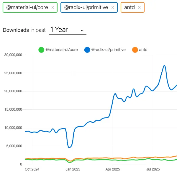
Is it popular? As of September 2025 it has 23 millions downloads per week. Which is huge compared to other mature components libraries, like antd(2M) or mui(1,5M).
Related concepts: Radix UI: A Modern Headless Component Library (LLM-Research) , Building a Lithuanian Law Assistant with LLM and RAG (part 1) , Do Not Use Mocks in Your Tests , Securing the UI Supply Chain .
Is it popular? As of September 2025 it has 23 millions downloads per week. Which is huge compared to other mature components libraries, like antd(2M) or mui(1,5M).
Let’s try understand why it popular.
What Design Prinicples are used in Radix UI?
Headless: components itself does not contain any styles included. Radix UI components can be styled with whatever styling approach you will select: tailwind-css, css-in-j or pure css. It is important when you do not want to grapple with the default styles overrides.
Uncontrolled: components are maintaining internal state, which allows developers focusing on features, they need to deliver, instead of managing core components state. If there is a need to controll componnts state, you can do it with props.
Composable: multiple components are defined as “compound components”, which allows customize components and compose the UI you need. This is a goto pattern for complex components opposed to monolithic components. Another unique feature of Radix UI components is “asChild” property of component. You can turn your add behaviour of Radix UI component to the child component:
import * as React from "react";
import { Tooltip } from "radix-ui";

export default () => (
	<Tooltip.Root>
		<Tooltip.Trigger asChild>
			<a href="https://www.radix-ui.com/">Radix UI</a>
		</Tooltip.Trigger>
		<Tooltip.Portal>…</Tooltip.Portal>
	</Tooltip.Root>
);
- Modular components: you can use package with all components exposed or you can adopt Radix UI component by component without bloating your bundle size.
npm install @radix-ui/react-dialog
Characteristics of Radix UI
Headless: no default sttyles.
Strong Accesibility Support: designed with the accesibility in mind for you to have WCAG compliant web app.
Granular Components Composition: web app can adopt component by component, having multiple component libraries in place. composable also on low level assigning behaviour to your components with composition.
Fully Typed: Built with typescript.
ES Modules: Exported as Ecma Script Modules enabling tree shaking OOTB with modern bundlers.
Ecosystem: Has ecosystem with prebuilt design systems (Radix Themes), colors (Radix Colors) and icons library (Radix Icons). Radix UI is a library that backs up shadcn UI library, which is also very popular in react community. Vercel implemented v0 (app vibe coding app) using shadcn.
Personal Feeling
I’ve tried Radix UI briefly for a cople of evenings. And started rigth from the radix-theme package. It is a package with preconfigured styles (which I was able override only with inlince CSS). Learning curve is steeper than Tailwind CSS. Component API is consistant and contains util types like in tailwind (mt=”4”). But it is a subset of tailwind alternative props. Any customization is either limited or not documented. Adding custom font, custom background was a challenge to me. I was forced to reach out GPT.
Summary
UI community values are represented by a downloads count of Radix UI, which shows trend to customizable low level primitives with built in accesibility.
On the other hand it has steeper learning curve, documentation and components count has room for improvement.
Together with compatibility with modern tooling and good DX - Radix UI still gains popularity, leaving mature prestyled libraries behind.